
Mt. Rainier Virtual Park Ranger App
For my graduate capstone project, I am designing a mobile app to improve accessibility for Mount Rainier National Park visitors. In Fall 2024, I conducted user research through surveys (Qualtrics) and interviews to identify key pain points. Now, in Spring 2025, I am working on the design process, analyzing the data to inform a redesign that enhances the user experience. I am implementing feedback from the user research and current testing to develop the app, while also creating Figma prototypes and sketches. Additionally, I am developing a research brief outlining the findings and proposed solutions.
Year
2024
Role
UX Researcher & Designer
User Interviews
User interviews were conducted in a semi-structured format, combining consistent questions with open discussion. This encouraged participants to share their experiences with the Mt. Rainier National Park website, helping to identify what worked well and what needed improvement.
The interviews primarily took place remotely via Zoom, with 30-minute sessions for each participant, and one in-person interview at a coffee shop. I took notes during the discussions.
My target users were first-time and second-time visitors seeking to simplify their navigation and trip planning. The goal was to reduce the time spent searching for information online, allowing them to visualize and plan their trips more efficiently.
Overall, participants found the site challenging to navigate due to cluttered pages and an overload of information. They recommended condensing content for easier access to key details, such as safety tips and park maps. Concerns included a confusing basic information page and unnecessary repetition in the “Things To Do” section, highlighting the need for a more streamlined experience, especially for newcomers.
Reorganizing the layout and using visuals strategically, along with incorporating a chatbot for quick assistance, could greatly enhance user experience.


Research Brief
This research brief provides a detailed account of the user research conducted during the app's development, covering every stage from user surveys to interviews. It offers a comprehensive breakdown of the entire process.
Design Process

The next step was brainstorming solutions to address the issue of new park visitors struggling to find current information on Mt. Rainier’s website. The design solution focused on restructuring the website to present clear, easily accessible information, enhancing the overall visitor experience.
The design process for the Mt. Rainier Virtual Park project began with formulating a "How might we" statement to address the challenges users faced while navigating the current website. From this exploration, I reached key conclusions that guided each step of the design process:
How might we enhance Mt. Rainier's online presence to support visitors before, during, and after their trips, making it a comprehensive resource for all stages of the experience?
Problem Statement: The AI-powered Virtual Park Ranger app provides first-time visitors with real-time updates, interactive maps, and personalized trip planning. It offers essential park information, including trail conditions, weather, regulations, and services, ensuring a seamless and informed Mt. Rainier experience.
Solution: It’s hard for first-time users to navigate the complexities of a National Park website when planning their summer trips, the AI Park Ranger simplifies the process by providing seamless trip planning tailored to specific National Parks, in this case, Mt. Rainier.
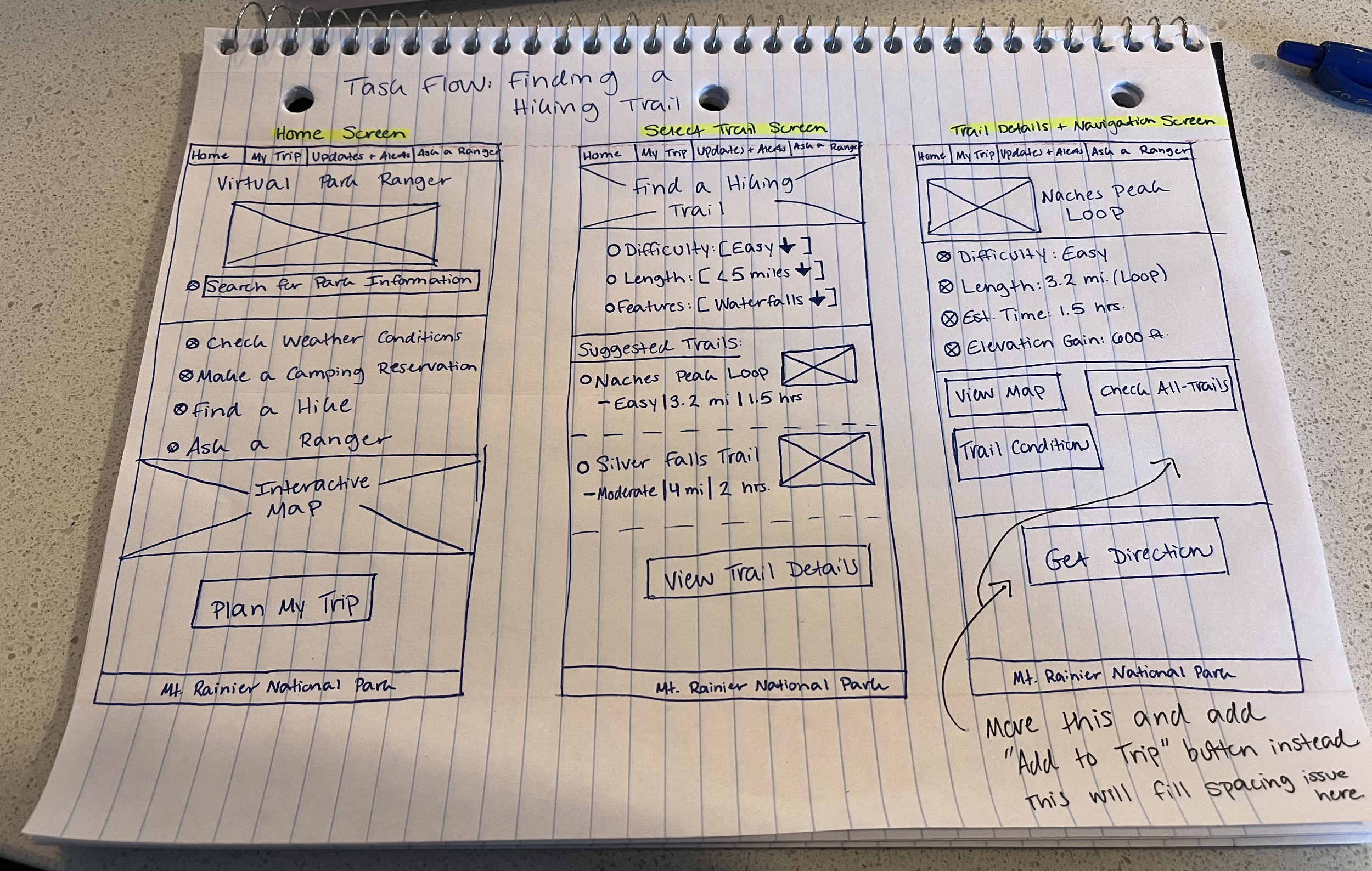
Storyboard: First-Time Visitor’s Journey
Through storyboarding, I explored the challenges a first-time visitor faces when planning a trip to Mt. Rainier. This process helped refine my How Might We statement to focus on first-time users in the pre-trip phase.
Findings from Storyboarding:
Overwhelming Information – Visitors struggle to find essential details like trail difficulty, weather updates, and regulations.
Scattered Resources – Park info is spread across multiple sources, making trip planning time-consuming.
Uncertainty & Anxiety – First-time visitors worry about safety, preparedness, and logistics.
Solution: AI Ranger
Based on these insights, I designed AI Ranger, an AI-powered chatbot embedded in the park’s website. It provides real-time, reliable information, streamlining the planning process. Future iterations could expand into a mobile app with GPS-based recommendations and offline features, further enhancing the visitor experience.

Screen Design to Design System
Refining task flows from the storyboard streamlined the transition to screen design, making layouts more flexible and intuitive. Prioritizing key tasks like Reserving a Campground and Checking Weather Conditions ensured diverse screen structures.
Sketching revealed a need for better visual variety and clarity. Adding hero images, utilizing white space, and refining interactive components improved usability. Annotations helped refine layouts, leading to more thoughtful design choices.
These insights shaped the design system, balancing a nature-inspired color palette with usability. Simplifying icons and menu toggles reduced clutter, ensuring a clean, functional interface while leaving room for future refinements.